Navigating immovable barriers.
The problem:
When working in the financial space, navigating a sea of laws, rules, and requirements is the name of the game.
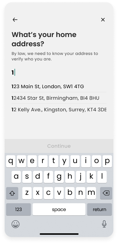
Onboarding users to a platform can be especially tedious. Regulations require companies to collect a robust set of information in order to open an account, which in turns leads to a confusing, and opaque onboarding process, that often leads to abandonment during the process. Add to that a general mistrust of financial companies by users, and you’re left with a situation that requires you to ask users who don’t necessarily trust you, for a lot of personal information they may not be willing to give.
So how do you come up with a process that not only meets all the rules, but also reduces abandonment, and builds trust with potential users?
A few initial points of discovery:
A majority of potential users are familiar with signing up for a financial platform.
Users aren’t necessarily concerned about giving personal information, they just want to trust the company they are giving it to.
According to our KYC (Know Your Customer) Partner, between 40-60% of users who are verified through the KYC (onboarding) flow, fail initial verification.
The vast majority of users we interviewed stated that they would not call customer service to complete secondary verification.
Most of users said they would complete a secondary verification if it could be done without leaving the onboarding flow.
Users stated that they would be most likely to give personal information if it was explained exactly what it was being used for.
How might we onboard users in a way that reduces flow abandonment and builds trust?
Mapping it out.
So how to get users from beginning to end without losing them, and while gaining their trust?
The first step was to map it out. To understand exactly what a user needed to do, along both the happy, and unhappy path. Once the paths could be visualized, design considerations could be made, and solutions could begin to be bought to life.

Bringing the idea to life.
Trust through design.
Finance can be a touchy and scary subject for a lot of people. When you want to deal with people’s livelihoods, they need to trust you. They need to know that you have their best interests at heart, not your own, which can often be a hard sell when you’re a for-profit company.
When it comes to onboarding, it’s often the first real interaction a user has not just with the app, but the company too. It was a key goal during the onboarding design process to start building a relationship with the customer and earning their trust at the first touchpoint.
From our research, we understood the necessity to be transparent. To help users understand why we ask for certain things. Throughout the onboarding flow, we made sure to summarize why we needed the info we asked for. For more sensitive information, we also made efforts to reassure the user that their data was secure.
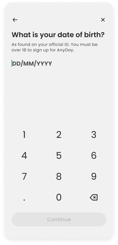
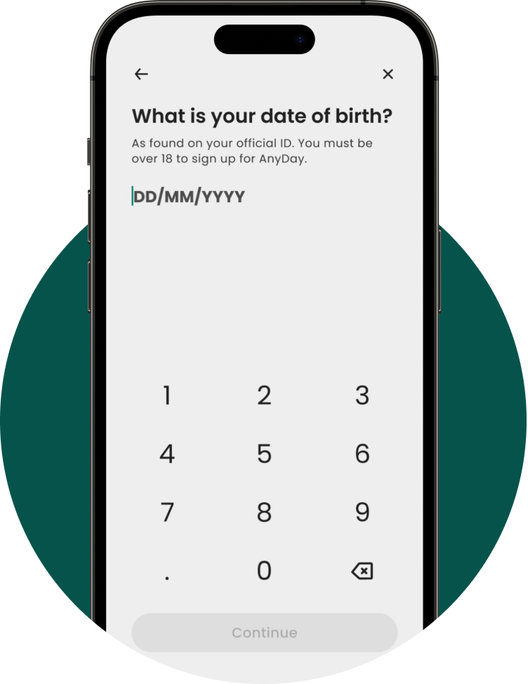
Designers often like to say “the less steps the better”, or “the faster the better”, and generally, I agree. However, when it comes to signing up for something that manages something like your money or finances, we felt the best way to build trust and comfort, was to walk users through the process step-by-step. To be overly clear about what was being asked at each step & why. We felt there were opportunities to possibly shorten the flow, group things together, and increase speed of completion, but ultimately, we felt those came at the cost of the user feeling confident, feeling like they clearly understood what was happening at all times, and felt in control of the process.
After much testing, we felt like the design achieved, was the right blend of speed and simplicity, while helping the user navigate around barriers to entry we simply weren’t able to remove entirely.
Click Phone to Play Video
Why no wireframes?
With a comprehensive design system established in Figma, the time it takes to wireframe vs. design in high fidelity is a wash. Designing straight to Hi-Fi saves time, and helps stakeholders better visualize the proposed designs.
So, did it work as intended?
You’ve got this far, and you’re excited to see how this test with real users, right?
Well if you’ve ever worked as a designer on any product, you know things don’t always go to plan. Short runways, trouble accessing users. Did I mention short runways?
So, we had to make do with what we had. People within the organization. Sure, I’d rather test with end users, but we’ll take what we can. Many team members fall within our ideal demographic, and to try and remove as much bias as possible, we chose to run the tests with people less familiar with the product. HR, Support, etc...
But, to finally answer the question, yes, with a few minor pieces of feedback, we felt like the final design was something we were happy moving forward with. With a plan to use analytics to monitor abandonment, and where it was occurring, when released to production, we were confident in the success of the flow.
100% of users were able to navigate from start to finish without prompting from the moderator.
6. The average score given for ease of use on a scale of 1-6, with 6 being the easiest.
Some confusion around what an “AnyDay Employer” was. Didn’t feel like the screen offered enough explanation of what it was. 33% of users noted they would probably skip this step instead of enrolling. Design team noted the need for a possible sheet describing the program and it’s benefits.
Users felt like it was clearly explained why we were asking for certain pieces of personal information.